Cinemark: 0-1 Redesign for iOS and Android
User-Centered Design
When I joined Cinemark, I was determined to provide a better user experience in our mobile app - the current rating was 1.8 stars, and I wanted the visual design to support and enhance its functionality. From benchmarking the existing app to creating the final designs, our users were at the center of our design decisions.
Benchmarks for Success
Finding metrics on the existing app was a crucial initial step in the redesign process. This foundation helped me pinpoint areas for improvement in the app and gain insights into our users.
Identifying Usability Issues
-

Navigation Menu
The navigation was tucked away in the hamburger menu. We implemented a bottom navigation bar to improve discoverability.
-

Contrast Ratio AA
We measured the contrast ratio on the text and discovered that it failed to meet the standard WCAG AA 4.5:1 contrast ratio.
-

Small Imagery
Small movie posters were used next to showtimes. We enhanced the experience with context by enlarging the movie poster and adding a movie still as a background.
-

Small Touch Area
The former app was using a small 38x20px tap area for showtimes, making it difficult to select. Apple HDCI recommends at least a 48x48px touch area.
Creating Personas
Following a user-centered design approach, we crafted personas of our audience. The personas helped us understand the needs, motivations, and pain points of our users, guiding us throughout the design process.
Collaboration
Whiteboarding sessions played a pivotal role in planning out user-centric features and provided a dynamic environment for the team to visualize concepts, sketch out user flows, and brainstorm solutions together. Collaboration during these sessions ensured diverse perspectives were considered, enriching the decision-making process and fostering a sense of ownership and unity.
Style Guide
We outlined new styles and standards to be applied throughout the redesign. This included color schemes, typography, UI elements, and layout principles, ensuring consistency and coherence across every aspect of the app. By providing a clear, shared framework, I aimed to streamline the design process and enhance the overall aesthetic appeal and user experience of our app.
Final Designs
-

Improved Navigation
We added a bottom tab bar. This allowed our users to quickly and easily navigate our application.
-

Easy Access
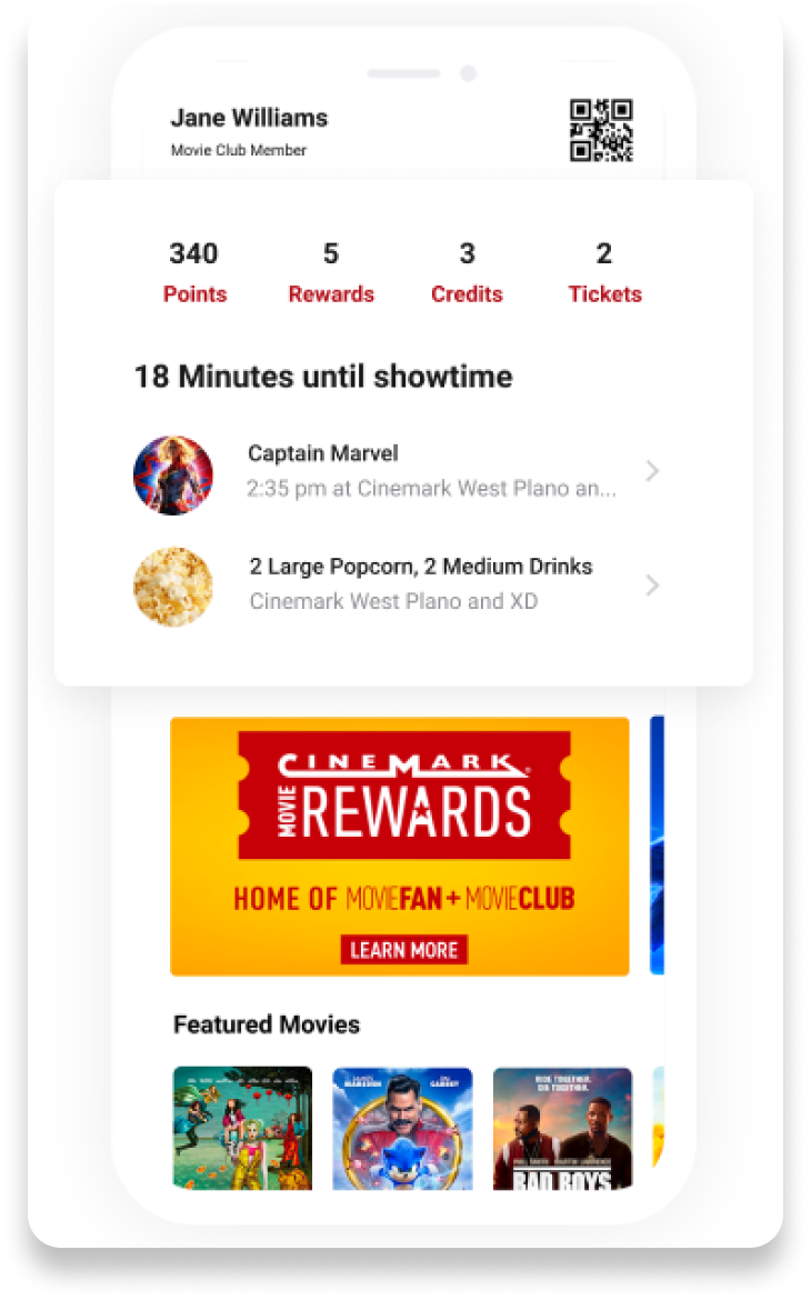
We added the user’s membership QR code, movie tickets, and rewards on the homepage so they could easily access these products at the theater.
-

Minimalistic Design
We introduced a clean design that allowed the content to be the main focus of the app.


